

But the Case Rates are Lower
Tracking the Wrong Denominator Part 2

So we are using the wrong denominator to calculate the Unvaccinated case rate. It turns out we need to be thinking in terms of the Non-Immune (NI) and Prior-Infection (PI) groups. And we calculated the case rates for the Non-Immune given the “Unvaccinated” rate from before. Here it is as a reminder - 40-49 year olds showing a greater than 10k/100k infection rate.
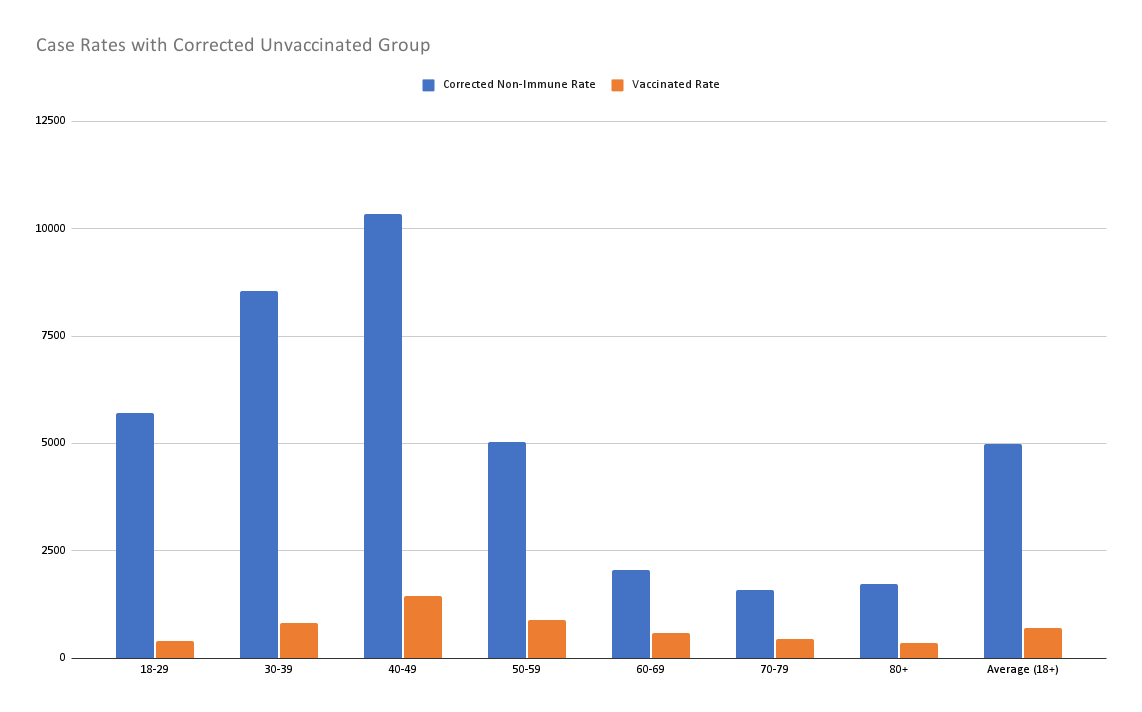
But there is a problem with this chart. For this to be true, the case rate among the Prior-Infection group has to be effectively zero. That’s unlikely to be the case. Unfortunately no one is tracking the populations separately. There are a variety of papers which try to quantify the immunity generated by COVID-19 infection. The estimates range from slightly worse (especially shortly after dose 2) to significantly better (the large study out of Israel). But we can easily invalidate the equality study with this data.
See if you can spot the problem:
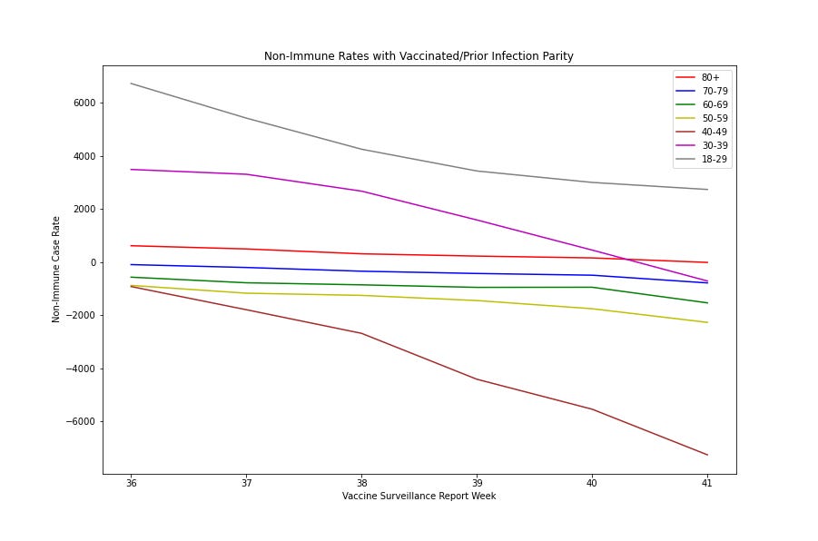
Your first thought might be - hey that looks familiar. Is that the same chart from last time? And the answer is no- but you could be excused for thinking that it might be. This is the chart of what the Non-Immune case rates MUST be if the Prior-Infected have exactly the same case rate as the Vaccinated. Do you see the issue? I’ll give you a hint - according to this chart, people are becoming uninfected and no longer ever had COVID-19. Negative numbers mean things are broken here. Not all lines go into the negative, but enough do (4 out of 7 live there and the last dips into the negative in week 41’s report). This clearly cannot be the case - negative case rates aren’t a thing. I’m not subtracting one case rate from another here, this is the implied NI case rate give that the PI case rate equals the Vaccinated Case Rate.
The cases are not equal and they cannot be higher than the Vaccinated Rate. If they were, these negatives would just get worse. So how low do we need to go?

The absolute highest that Prior-Infection rates can be for all Non-Immune rates to be positive happens around 50% +/- 1%. So natural immunity is a minimum of two times as effective. It is possible this number is age stratified. You can see from this chart that 18-39 would have been clear for a lot longer. In fact at 90% both of those lines are above 0. But this is a minimum and in both cases, vaccination IS superior. The question is mostly how much better is it?
Continued…