
Possibly the Last UK HSA Weekly Update For Week 13
Possibly the Last UK HSA Weekly Update For Week 13
They say no more case charts as of next week

Definitely not happy with the news - I still hold out hope that we will continue to see Admissions and Mortality data, but I cannot promise anything. So for what might be the last time - let’s get started.
Overall
I had somewhat expected that we’d see a bigger uptick in mortality, but it looks like this is just the very start of that up-trend and unfortunately, hospital admissions continued to rise.


Here are the rates, fixed-scale per outcome.

2 Doses vs Boosters

As you can see, the pattern is continuing. I’d look for the 2 Dose rate to be roughly equal to the 3 Dose rate in 80+ next report. The trend certainly doesn’t seem to be reversing.
I’d like to try to put into words the reasons that I focus on these charts first thing each week. There are contentions over Unvaccinated denominators. Is ONS or NIMS or some combination of denominators more appropriate to be calculating the rates for the Unvaccinated. I think it misses the larger problem of contamination of the Unvaccinated cohort which I suspect is a much bigger issue.
Denominator issues pretty much don’t exist here. Regardless of the number of doses you have, these are people with recent, confirmed contact with the NHS. Their counts should be considered highly accurate and the NIMS Cohorts are regularly corrected for deaths. Given that, it’s also important understand that the smaller denominators in the 2 Dose cohorts (MUCH smaller for the older ages, and even in 18-29 a small majority of all 2 Dose vaccinated people are ALSO boosted, even if their overall prevalence in the age bracket is smaller), act as multipliers on the effect of each single case against the case rate. So if each cohort added 1 case, the 2 Dose cohort would add more to the Rate/100k. I threw together a quick chart of this effect.

Each row shares a Y axis. You can probably discount the 1 Dose row as it gets over 60. There is hardly anyone in that cohort. Even a single case makes a huge impact. But in the 2 Dose cohorts, a single case can be 5, 10, even as much as 30X the impact as in 3 Dose cohorts. So we would expect that 2 Dose rates would tend to be higher.
While it is true that the opposite is true and 2 Dose rates will fall faster, that will only happen if cases are going down, and they are not. Case rates are up across the board - but much more in the boosted than in the 2 Dose vaccinated (except at the edges).
Interestingly the 1 Dose rate increases are even lower even into the 70s with a 1:125 ratio of impact.
All of these populations are NOT subject to denominator size issues, which means that many of the complaints against them aren’t valid, at least on that front. It implies that there is a fundamental difference between these cohorts that needs explaining.
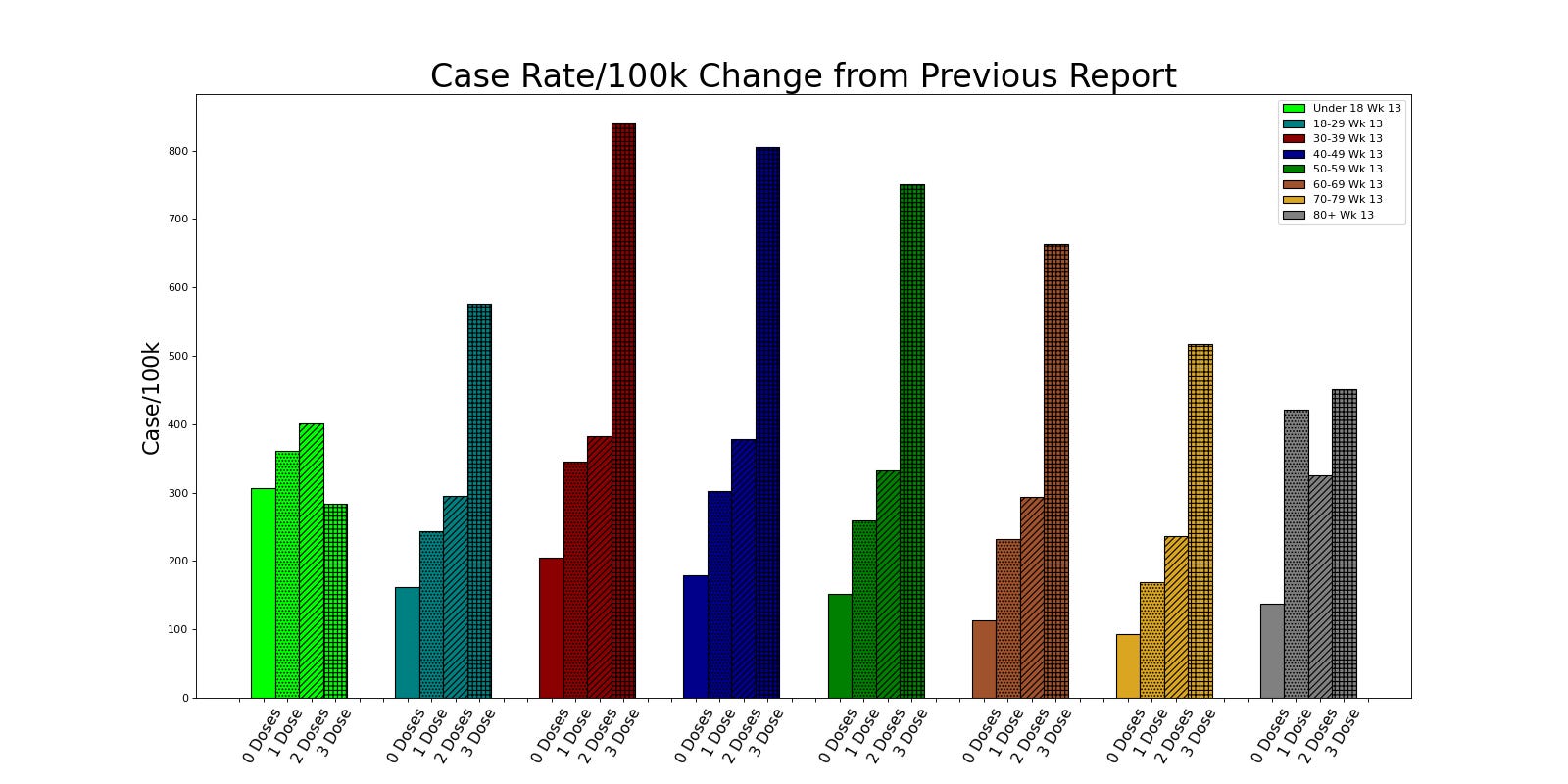
Cases


Here are the current rates - boosters are sky high relative to everything else. The normalized chart I normally show looks like this.

All rates are falling against the booster rates. In this case we know from the Deltas I already showed you that they are rising more slowly.

Distribution of cases hasn’t shifted that much - still mostly boosted, but the amplitude of the shift is smaller. Which means the overall chart looks a lot like it did last week.

Admissions
Admissions continued to increase this week

It’s actually a rather large raw jump in numbers on the 3 Dose 80+ cohort and very sudden again this wekk. The same is true in 70-79. The single dose cohort in 80+ has had a small spike in cases which has driven it’s rate up. You can see on the raw chart below that the actual number of 1 Dose admissions is very low. Remember the ratio is nearly 1:130

Normalized to 3 Doses we see that Unvaccinated 80+ are at very nearly the same rate. While people argue denominators, the NIMS denominator in the older ages is considered better because most of that population has had frequent contact with the NHS, so here, the NIMS denominator is probably the correct one.

Deltas reflect that 1 Dose ratio, but as usual, most rate changes are still in the oldest cohorts rather than the young.


There is a small increase in the ratio of 3 Dose 50-59 and 80+ cohorts in overall representation in admissions, but the chart remains largely unchanged.

Mortality
This week saw the very start of an uptick in the raw number of older 3 Dose deaths.


I suspect this trend will continue as it lags Admissions by roughly 2 weeks.

Normalized rates continue to show efficacy in most ages - really anything under 50 has too few cases to be well sampled. Interestingly, 2 Doses continues to show significantly worse outcomes, especially in the older cohorts more likely to have good NIMS denominators. This is actually interesting and unexpected except for the huge spike in 2 Dose case rates earlier this year. I’m having trouble coming up with a good explanation for this. It might go back to that chart I started last week with.

The deltas are interesting. Big drops in both 1 and 2 Dose 80+ and small increases elsewhere. The distribution is kind of all over the place in terms of vax status though almost all in those older than 50.

Here we see the first large change of the population percentages. 3 Doses and 80+ has a big increase which is mostly offset by a drop in 2 Dose 80+
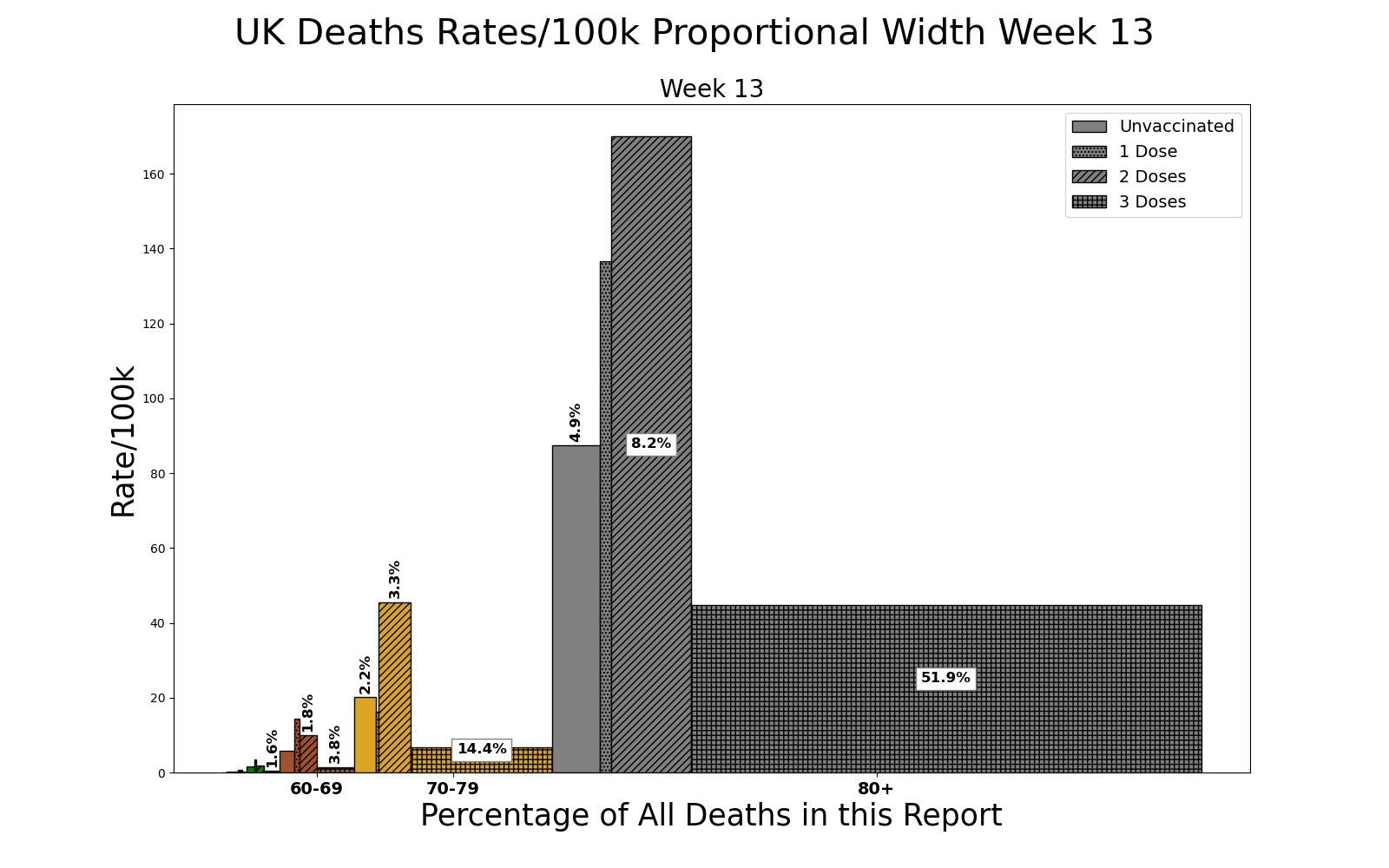
So the overall proportion of deaths in the 80+ stays largely unchanged, but more of them are now in the 3 Dose vaccinated.
Conclusions

We are starting to see admissions creep up to the vaccination percentage line. It’s offset by age (aside from an odd bump in the 30-39 cohort - which could be a denominator issue). If you start at 40-49 and continue up the ages, you can see the admission (middle ring) get closer and closer to the edge of the shadow line (overall percentage vaccinated - any number of doses).
Deaths in the under 50s should be ignored as the numbers are so low that even a single death switching categories will radically skew the results. There were 2 Under 18 deaths this last report for instance. But you can see that the deaths trend (outer ring) is ALSO age driven and getting much closer to the overall vaccinated percentage. You can look left to right across the bottom row and see this. I suspect it is a combination of time since boosting (80+ was first) and overall health.
Sometimes I think it that stepping back to one of these views is extremely useful to get a feel for how things are going overall. Individual rates can fail to paint the bigger picture.

Similarly, looking at risk regardless of vaccine status but only by age can be very telling. Please feel free to steal any of these charts and post them to social media. Links back are appreciated of course, but not necessary. The idea is to get this information out there in a way that possibly people haven’t seen before and maybe wake some slumbering people up from their torpor.
I have a couple more topics I do want to cover so I will try to get back to you soon.