Wow. Just Wow - new UK Data Really Hits a New Level
And Omicron seems to be the major infection source in the Unvaccinated a well
I don’t swear. It’s not that I won’t ever swear, but I feel like it should be reserved for seriously out of the normal situations. I barely swear in my head even. But when I looked at the new vaccinated case rates in the UK, my only thought was “HOLY SHIT!”.
Let’s take a look and then discuss what it means (and doesn’t mean).
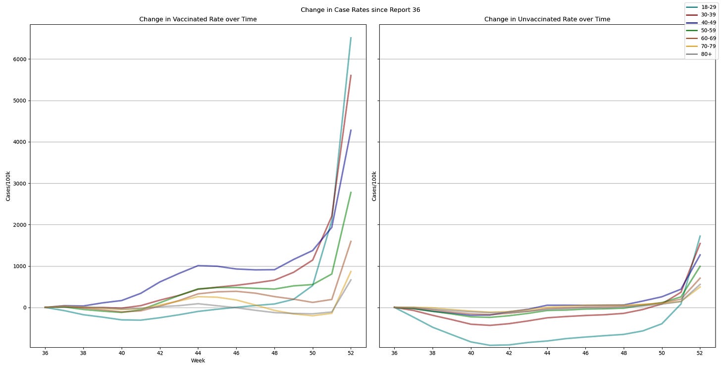
Yes, that’s an increase of over 4400/100k for 18-29 Vaccinated based on only 2 weeks of data (one being removed and one being added, 3/4ths of the total case count is the same as before). Part of me thinks that if that increase is driven mostly by local prevalence (and the UK is running at a normalized rate of nearly 950k positives/day if you scale it’s population to the size of the US) that everyone in the 18-29 age group should increase at the same rate. Though if we are seeing a breakdown of the vaccines (and the start of TRUE negative efficacy) and my thesis on the makeup of the “Unvaccinated” cohort here, then we COULD be seeing the same rate of increase, but it’s masked by the much better natural immunity in the “Unvaccinated” group. (Omicron does seem to be better at evading natural immunity).
But maybe this isn’t the best view - all of these look somewhat exponential with different starting points. It might be most interesting to see what percent change in case rates there are. Yes there is a CRAZY high 18-29 year old rate of 7221/100k (just short of 1/10 people are infected) but that’s also a factor of the lifestyle being led. This is true by age as well as by vaccination status. Are the unvaccinated being more careful (I’d argue that it depends on WHY they are unvaccinated, but my unvaccinated friends are basically done with COVID and just want to live their lives). But it make sense for a highly transmissible variant to affect the young more than the old because they are much more likely to be out and about in public in densely packed areas. And as I’ve discussed in the past, the 40-49 year old cohort is most likely to have teenagers at home who transmitted to them through school (or they got at work).
So maybe it isn’t the raw rates we care about as much as the percent change in rates from week to week. Let’s look at that here.
Oh wow - so 70+ isn’t look so great anymore. I wonder if this is Omicron getting loose in long term care facilities or the post Christmas spike (that would probably be “best case” whereas worst case is we are already seeing boosters failing against Omicron. Some of this is their initially very low rates, likely due to lifestyle. If you compare the charts, you can see that the lowest numbers on the vaccinated side of the top chart gives the highest numbers here. You can also see that other ages are growing faster, but it’s a much smaller difference between the left and right sides. Interestingly the vaccinated rates are all over the place much more than the unvaccinated. To me this implies that the “Unvaccinated” are more homogeneous. This makes sense if the following are true:
Natural Immunity is fairly consistent over time, and especially it doesn’t tip over into negative efficacy.
Those with prior infections have more consistent levels of protection over time, regardless of antibody levels. (IE T-Cell response instead of Antibody response)
The truly unvaccinated have similar immune function as a function of age.
All of these seem likely to be true, based either on data, or in the case of #3, because those with poor immune function likely self selected for vaccination. This does mean that this probably skews vaccine performance somewhat negative since the immune compromised are unlikely to generate many antibodies even when vaccinated. If they did, they wouldn’t be immune compromised.
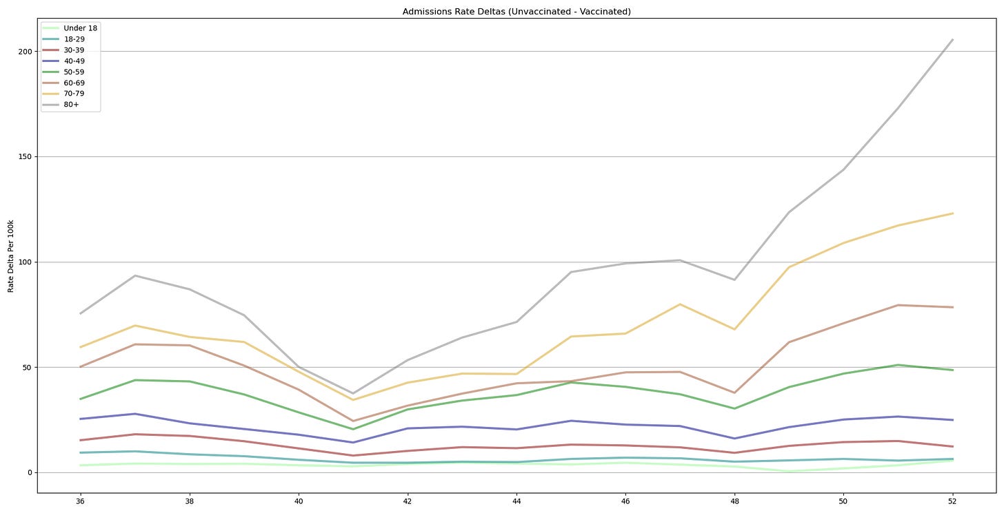
This rate increase is enough to flip the rate deltas back to negative for ALL ages over 18. But you can see that even the Under 18s are dropping rapidly now.
This is the kind of discontinuity on a chart I’ve been looking for. A major change that upsets the narrative the chart has been telling up until now.
Remember that this chart is relatively immune to point prevalence of COVID in the population since it compares two rates, both of which are in the same population at the same time. We can see this with the generally smooth data with minor undulations up until about week 48-49 (the start of December in other words), the total number of cases in this period went through significant undulations. Then a major change. It’s important to remember that this could be (as we know it is) a major increase in vaccinated rates which significantly outstrips an increase in unvaccinated rates, or even a huge drop in unvaccinated rates with only small or non-existing drop in vaccinated rates. We can’t tell from this chart, but we do know that given a fixed point prevalence for both terms in the equation (Unvaccinated Case Rate - Vaccinated Case Rate), there has been a major shift in one or the other but not both.
The news isn’t all bad for vaccines. As is widely reported (and so far, accurately reported from what I can tell), admissions and mortality (with COVID) are still much lower for the vaccinated.
Interestingly mortality rate changes are nearly entirely in the 80+ population whereas hospitalization is 70+. This is a very real increase in rates. The same caveats do apply. The unvaccinated population is very small and likely unvaccinated for a reason. But the effect is real. Moreover, the case rate deltas remain large.
Here we see a general blooming in the deltas for 50+. If we look on a per positive test basis however, the picture looks more stable (while still being significantly higher in the unvaccinated.
Honestly these seem mostly flat with mortality one what looks like a slight downtrend. But previously I have commented that there is a clear lag in cases and admissions as well as admissions and mortality. So I reran these charts. Admissions uses case rates from 2 weeks prior and mortality from 3 weeks prior. Here is what I get.
I see a pretty clear downward trend overall here, and especially in mortality. That being said, the deltas are still high between the vaccinated and unvaccinated. So it does appear that protection against hospitalization and death might be waning slightly, but really it looks pretty flat over time if you do end up getting COVID-19 and it is a pretty significant effect. It seems like there is still a clear benefit for vaccinated in the 60+ cohort when looking JUST at admissions and mortality WITH COVID-19 (this analysis is ignoring other all-cause mortality intentionally).
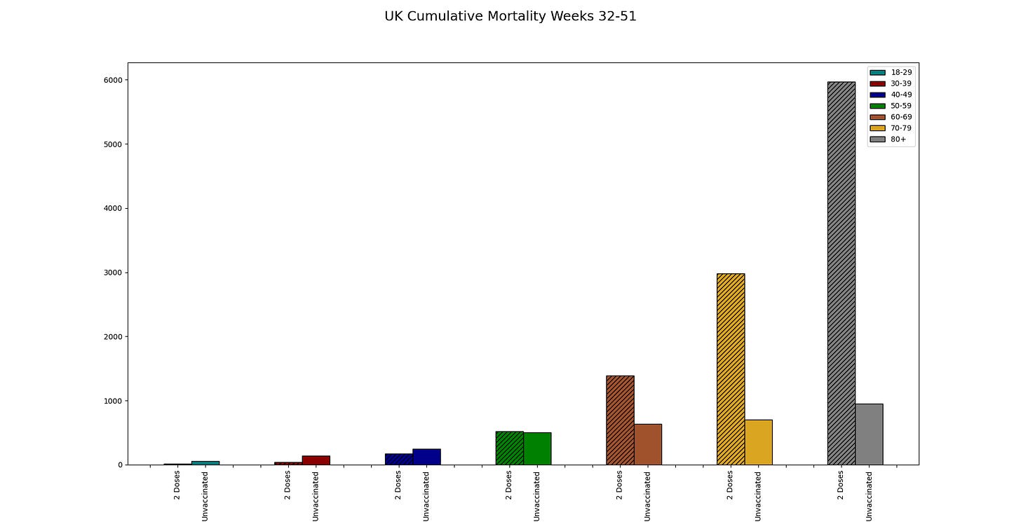
This week being the an evenly divisible week, I can update the raw cumulative cases. Here I want to post the one I posted last time (which was weeks 32-47) so you can directly compare it to this week (through week 51)
The overall case distribution 40+ didn’t change much (there are changes but they are subtle), but under 40 has massive changes. In 4 weeks the 18-29 raw case numbers went from being JUST above 50% of the total to being more like 70% of the total. The next time someone tells you this is a “Pandemic of the Unvaccinated” please show them this chart. You can follow up with these:
Over 50, the majority of all hospitalizations and death are vaccinated. Plus those are the biggest categories in general. It is simple to see that the majority of those in the hospital with COVID in the UK have been Vaccinated and an absolutely massive majority are vaccinated. (For these charts, vaccinated is 2 doses or more. While the booster dose uptake percentages are in the Vaccination Coverage chart, they are not provide in these charts.
So what is the takeaway? For me it is this - keep a close eye on admissions (raw and rates) in the next two weeks given the lag in admissions after COVID positivity (most people don’t go downhill for 7-10 days) and something fundamental has changed in the situation for the vaccinated. That something seems to be a loss of protection which vastly exceeds the previously apparent negative efficacy. This is the chart signal I’ve been keeping my eye out for. This indicates a state change in the world that cannot be treated in the same way as before.
What I’m not seeing is a clear DECREASE in hospitalization by positive test of the vaccinated vs the unvaccinated. We’ve heard from the UK and others that the vaccinated are MUCH more likely to be Omicron positive than the unvaccinated. This SHOULD imply that we will see a clear signal of reduced hospitalizations at least on a per case basis (we might see this now, but I’m not charting it, I’ll look into doing that). The other option is that I’ve been right all along and the majority of the “Unvaccinated” are previously infected. This would mean that they are ALSO massively more likely to be Omicron positive instead of Delta and their numbers are keeping the Delta/Omicron ratio between the groups from being very large and so change in the rates of hospitalization on a per case basis very much.
Let me know what you think. I think we are in for an interesting winter.


Thanks for sharing.
"But the effect is real."
If the denominator is shrinking for the unvaccinated through non-covid deaths or getting vaccinated. Would we be able to see this effect?
Example:
4/12 UnVaxxed = 40/120 SurvivedVaxxed
4 get vaccinated and die from covid.
4/8 >= 40/120
This would look like a 50% mortality increase in unvaccinated no?